

Brew and Sip Mobile Application
Brew and Sip is a client based project that would help a new coffee shop business based in Wisconsin with a mobile application.
Role: UX & UI Designer
Tools: Figma, Miro, Maze
Duration: 3 weeks
Methods: Competitive Analysis, User interviews, Surveys, Wireframes, Mockup, Prototypes
Overview
Problem
Problem Statement:
Create a mobile application that will service a new small coffee shop business in Wisconsin. The app needs to do the following:
Ensure customers are able to see the full-menu on the app
Place mobile orders - ensure that customers can do so through the app
Allow customers to earn rewards through the app when purchasing menu items
Show shop’s events and new menu items on the app
Solution
Create and design a minimalistic mobile application that would help solve the four main goals for Brew and Sip: view full menu on the app, place mobile-orders, customize orders and have a digital loyalty rewards program. The application was created using the user-centered design process in mind and really understanding what the user wanted and found important in a coffee shop app.

Target Audience
Adults ages 18-60
Coffee lover, drinks coffee
Live in Amery, WI or in the surrounding area
Process
Discovery and Research
In the course of the discovery phase, I wanted to understand the general needs of the potential users to develop an app that would meet their needs and goals. I began collecting data by administering an online survey. I avoided a screener question because I wanted to understand users who do not or have not had an app like this downloaded on their phone, in addition to the present coffee app users. I got a total of 29 responses, and from those responses, I interviewed three applicable participants.
Competitive Analysis
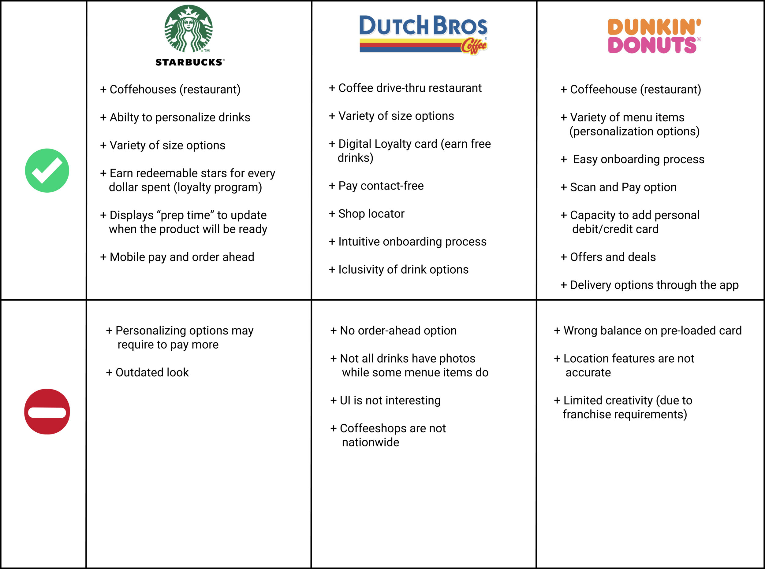
As I waited to collect the data from the surveys, I decided to execute a competitive analysis comparing the top three leading coffee houses in the US. I wanted to know what these companies were doing well and how I could fill the missing gaps through the Brew and Sip app.
SWOT Analysis

I wanted to hone in on Starbucks and obtain a greater understanding of why they were the leading coffee house globally. I was mainly focused on their strengths since they have an almost five-star rating on the Apple App Store.
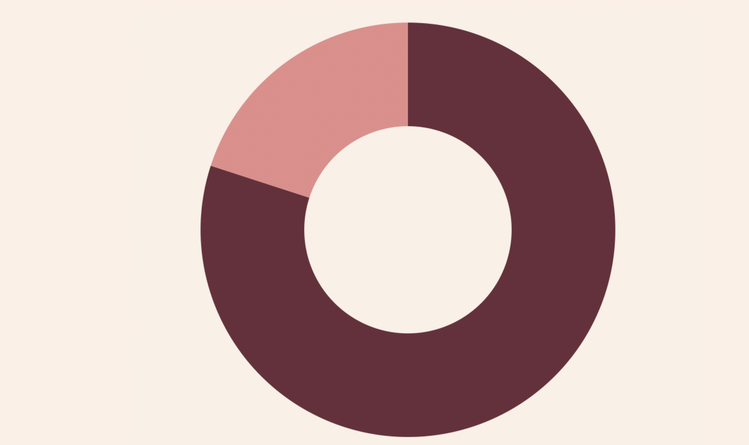
Survey and Interview Findings
29 - Survey Responses
3 - User Interviews

Out of the 29 participants, 20 have had or currently have the Starbucks app downloaded on their phone. This made the SWOT analysis of Starbucks even more important because Starbucks is a top competitor in the industry.

5 participants have never had a coffee shop app downloaded
Survey Findings:
Loyalty Program
2. Free Birthday Drinks
3. Deals and Offers
Based on my research, I decided that I would design an experience that would allow the user to view the full-menu on the app, place an order and have the ability to customize their order, digital loyalty program, and allow the users to view shop events and new menu items.
Interview Findings:
1. Customization
2. Variety other than coffee
3. Loyalty Program
I like Starbucks because they offer customizable non-coffee drinks
A major key for me is points/loyalty system (free drink after so many points)
I like when they have a lot of options when customizing their drinks. I feel like I can try a new drink every time.
Persona
Emma Nielson

Pain Points
Long wait times at the shop
Unsure if the order will be correct or if it be ready on time for pick-up
Not enough options to customize the way I like my drinks
“I love a latte but sometimes I want to mix it up and don’t want to take too long in the line so I scroll through the customizations options.”
Empathy Map

The empathy map was consistent with the target audience and persona, which I established based on the qualitative data from the surveys and interviews. The point of the empathy map is to develop a better understanding of the user's needs while better understanding their needs and goals while ultimately empathizing with their pain points.
Journey Map

I created the journey map to understand the user's expectations for a specific task place to use a mobile application which is to customize their drink. The goal here is to remove obstacles and make the process more effective and intuitive.
Informational Architecture
How Might We

I came up with several of these "how might we" questions with the POV of the potential users. Overall, the research helped prioritize four possible solutions over the rest.
User Flow
User Story: As a user, I want to be able to view the menu through the app and place an order
User Story: As a user, I need an option to customize my drink so that I can have a happy stomach
User Story: As a user, I want to be rewarded for being a loyal customer, so that I feel valued

With the defined user stories, creating a user flow would help define the user experience through screens users would interact with.
Sketches


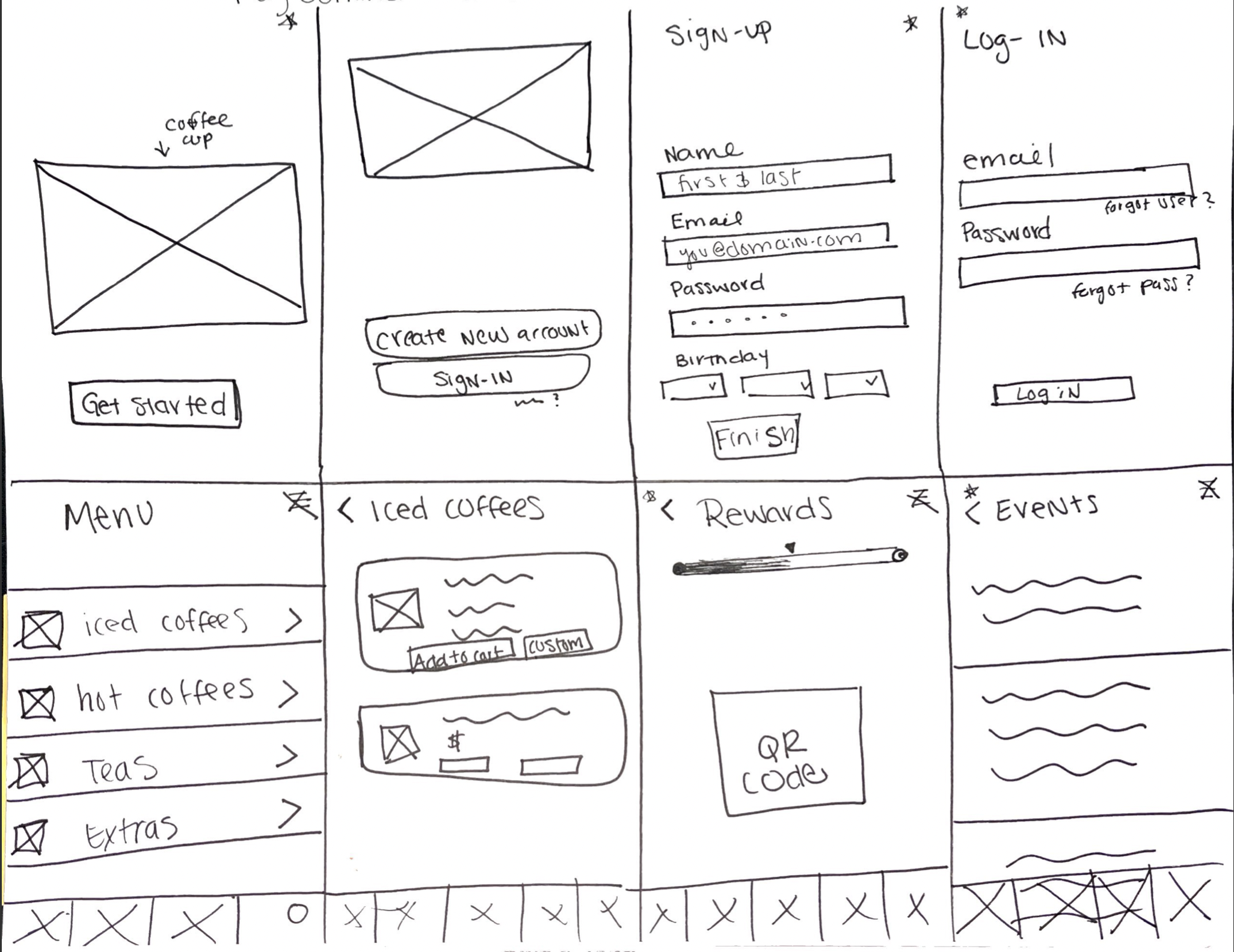
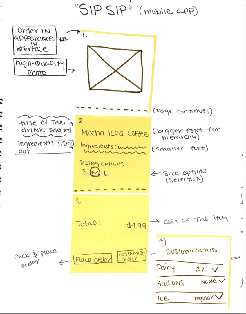

Once I was able to hone in on the solutions based on the hard evidence the data had given me, I began sketching ideas to help solve our problem. I created solution sketches that later helped me turn into wireframes. Through sketching, I set aside all the technology and really immersed myself into finding one solution. I got stuck with one of the screens and decided to continue ideating and iterating to find the solution for that screen.
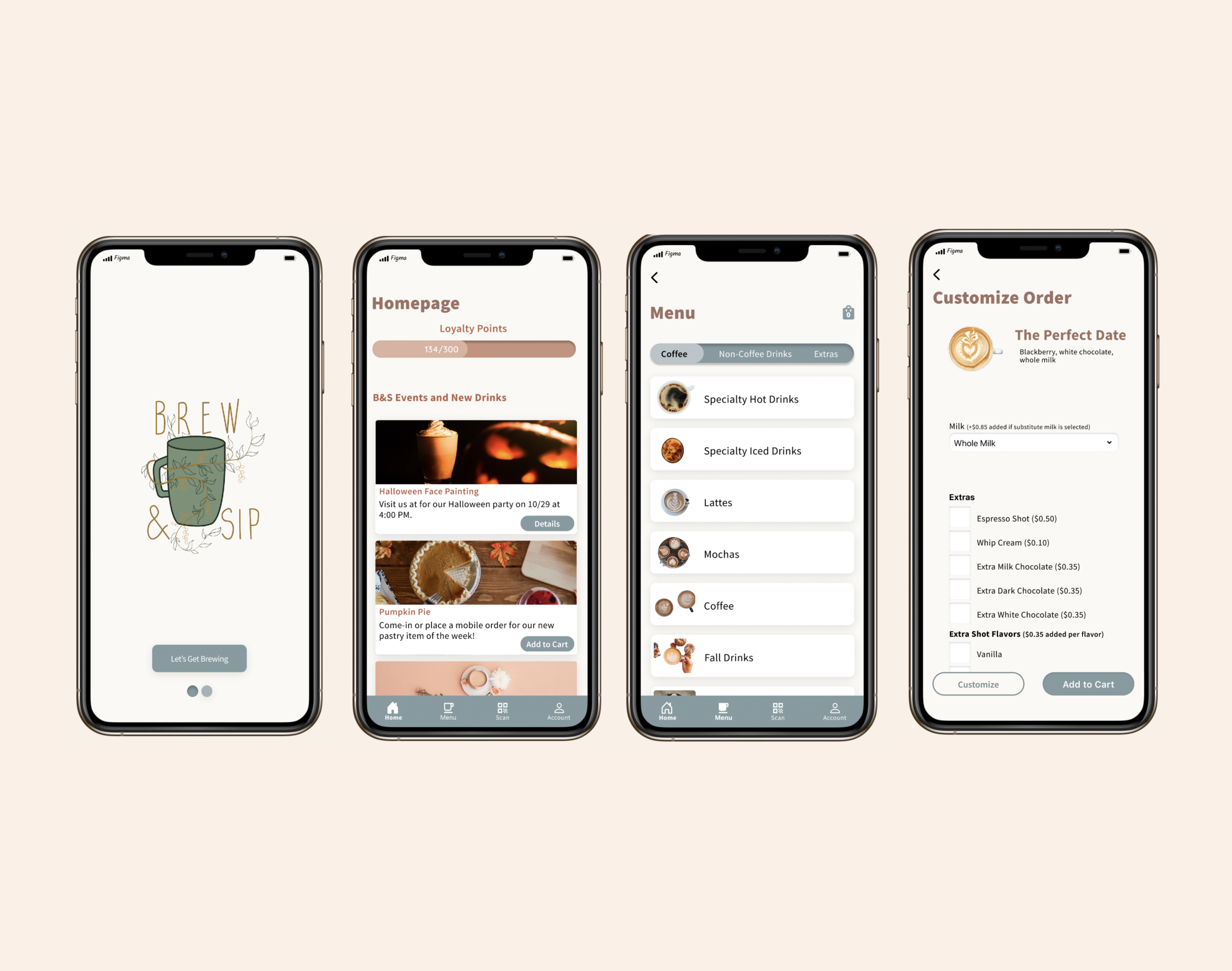
Wireframes

While creating the wireframes, my main focus was simplicity, readable information, and clean UI. Furthermore, I wanted to include as many pictures as possible to help the user decide on a drink based on an image rather than the description alone. With the iterations of my sketches, I found the screens I would use for the application.

Ideating on wireframes...
While I was happy with the screens for the application, I was not 100% set with how the menu screen turned out. I felt that there was a more intuitive way to make this screen more user-friendly. I, again, began iterating and found a better solution for the ‘menu screen. This page was not only more user-friendly, but it would also help them know that Brew and Sip have a variety of drinks other than coffee.
Prototype
7 - Participants
2- Paper Prototypes Participants
3 - Maze Participants
2 - Figma Mirror Participants
Paper Prototype
Before I completed my final prototype on Figma, I created a paper prototype to test among two users to see if there were any major blockers. I found the following blockers:
Buttons were missing so that user could not continue to the next screen
Need to include a feature where a user can select the time when they will pick up their order

User tester testing with the paper prototype

Blocker: There was not an option to select the desired size
Summary of Testing
I tested my final prototype with a total of 5 users. I conducted three tests using Maze through Zoom, and conducted two using Figma Mirror. They had five task to complete:
5 Tasks
Turn of notification
Find the QR code
Place a drink in cart
Order two drinks, and place them into cart
Customize your drink
5/5 participants completed task 1

5/5 participants completed task 3

5/5 participants completed task 5

5/5 participants completed task 2
4/5 participants completed task 4
What I Learned
The paper prototype helped me identify numerous blockers and aided me in designing an intuitive app for the later participants. However, even with the paper prototype, there were disconnects between a few screens and the users.
Make the homepage more interactive
Allow the user to return to the menu intuitively
“I think the app works as it should. The options for everything are easy to find.”
“I loved how easy the app was. The only thing I would change about the app is the organization with the drinks.”
“That task was confusing. The wording confused me.”

Final Thoughts
The high-paced sprint does not mean you cannot have a prototype ready within days. I learned early on that being a perfectionist while working in a fast-paced environment can hold you back. On the contrary, it is vital to pay attention to the important details. I learned that wording plays an enormous role in usability testing. Before I go and test the prototype, I need to go over my tasks with at least three people. Test, test, and continue testing because it is crucial to find the blocker before the product goes live. Always continue to iterate and ideate on your ideas. Never stop.